
Mastering Responsive Design: A Guide for Modern Web Developers
In today's multi-device world, responsive design isn't just a nice-to-have; it's a fundamental requirement for any successful website. Users access the internet on an ever-growing array of screen sizes, from smartwatches to massive desktop monitors. Providing a consistent, optimal experience across all these devices is paramount for user satisfaction and business success.
What is Responsive Design?
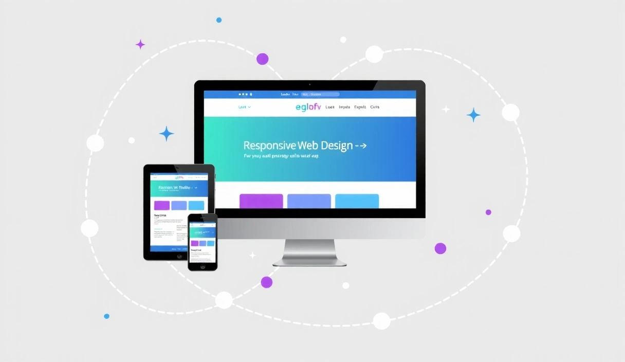
Responsive design is an approach to web design that makes web pages render well on a variety of devices and window or screen sizes. Instead of creating separate designs for mobile, tablet, and desktop, a single design is crafted to adapt fluidly. This is primarily achieved through a combination of flexible grids and layouts, images, and an intelligent use of CSS media queries.
The core idea is that the content should respond to the environment it's being viewed in. This means:
- Fluid Grids: Layouts are built using relative units like percentages, not fixed pixels, allowing them to scale.
- Flexible Images: Images are also sized relatively, preventing them from overflowing their containers.
- Media Queries: CSS rules that apply styles based on device characteristics like screen width, height, resolution, and orientation.
Why is it Crucial for Your Business?
Ignoring responsive design can have severe consequences for your online presence. Here's why it's non-negotiable:
"Mobile internet usage surpassed desktop usage years ago, and that trend continues to accelerate. If your site isn't mobile-friendly, you're alienating a vast portion of your potential audience."
- Improved User Experience: Users expect a seamless experience. A non-responsive site leads to frustration, forcing users to pinch, zoom, and scroll excessively.
- Higher Search Engine Rankings: Google prioritizes mobile-friendly websites in its search results. A responsive site is a key factor in improving your SEO.
- Increased Conversions: A positive user experience directly translates to higher engagement, longer visit durations, and ultimately, better conversion rates for your goals, whether it's sales, sign-ups, or inquiries.
- Cost-Effectiveness: Maintaining one responsive website is generally more efficient and cost-effective than developing and managing separate websites for different devices.
- Future-Proofing: With new devices constantly emerging, a responsive design approach ensures your website remains accessible and functional on future screen sizes without needing a complete overhaul.
Key Principles of Responsive Web Design
To effectively implement responsive design, several principles guide the process:
1. Mobile-First Approach
Start designing and developing for the smallest screens first. This forces you to focus on essential content and functionality, leading to a leaner, faster, and more user-friendly experience on all devices. Once the mobile experience is solid, you can progressively enhance it for larger screens.
2. Flexible Grid Layouts
Instead of fixed-width layouts, use percentage-based or flexible grid systems (like CSS Grid or Flexbox). This allows content blocks to resize and rearrange themselves gracefully as the viewport changes.
3. Media Queries
These CSS rules allow you to apply specific styles based on the characteristics of the device. Common media queries target screen width, enabling you to adjust layouts, font sizes, and visibility of elements for different breakpoints.
@media (max-width: 768px) {
    .container {
        padding: 0 15px;
    }
    .hero-title {
        font-size: 2.5rem;
    }
}
4. Flexible Images and Media
Images and videos should scale proportionally with their containers. Techniques like setting max-width: 100%; and height: auto; for images are crucial. For more advanced control, consider using the srcset attribute to serve different image resolutions based on the device.
5. Touch-Friendly Navigation
On touch devices, navigation elements need to be easily tappable. Large buttons, clear spacing, and intuitive menus (often hidden behind a "hamburger" icon on mobile) are essential for a good mobile user experience.
Tools and Frameworks for Responsive Design
While you can build responsive designs from scratch with vanilla CSS, modern frameworks significantly streamline the process:
- Tailwind CSS: A utility-first CSS framework that makes it incredibly easy to build responsive designs directly in your HTML with classes like
md:w-1/2orlg:flex. - Bootstrap: A comprehensive framework offering a responsive grid system, pre-built components, and JavaScript plugins.
- CSS Grid & Flexbox: Native CSS modules that provide powerful tools for creating complex, flexible layouts without relying on frameworks.
The Future is Responsive
As technology evolves, the importance of responsive design will only grow. With foldable phones, smart TVs, and other innovative devices entering the market, websites need to be more adaptable than ever. Investing in responsive design now ensures your digital presence is robust, user-friendly, and ready for whatever the future holds.
At CreativeDock Web Design Studio, we specialize in crafting beautiful, high-performing, and fully responsive websites that deliver exceptional user experiences across all devices. Contact us today to discuss how we can help your business thrive online.