Mastering Responsive Design: A CreativeDock Approach
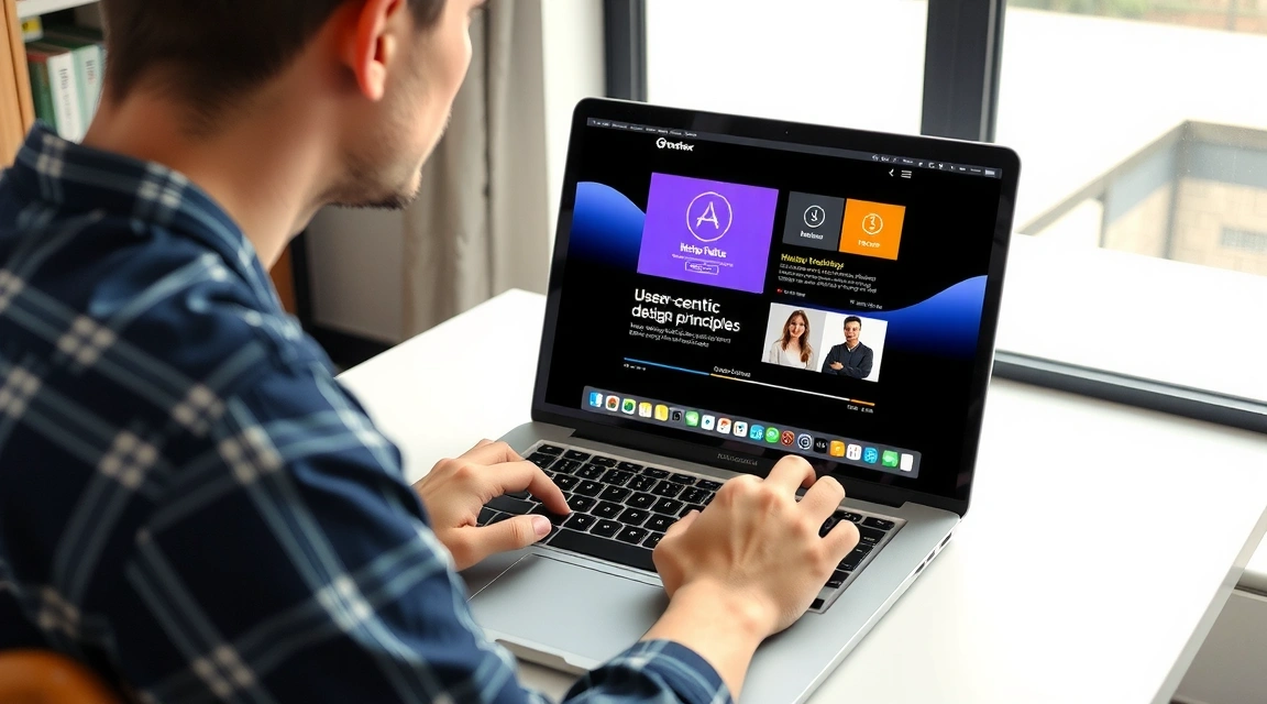
In today's multi-device world, responsive web design isn't just a trend; it's a fundamental necessity. At CreativeDock, we don't just build websites; we craft digital experiences that seamlessly adapt to any screen, ensuring your message resonates with every visitor, regardless of their device.
Why Responsive Design is Non-Negotiable
The digital landscape is constantly evolving. From smartphones and tablets to desktop monitors and smart TVs, users access the web through an ever-growing array of devices. A non-responsive website offers a frustrating experience on smaller screens, leading to high bounce rates and lost opportunities. Conversely, a well-executed responsive design:
- Enhances User Experience: Content is easy to read and navigate, reducing pinch-to-zoom and horizontal scrolling.
- Boosts SEO Rankings: Google prioritizes mobile-friendly websites in its search results, directly impacting your visibility.
- Increases Conversions: A smooth, consistent experience across devices encourages engagement and action.
- Reduces Maintenance: One website to manage, rather than separate desktop and mobile versions, saves time and resources.
Our Core Principles for Responsive Excellence
CreativeDock's approach to responsive design is rooted in a few key principles that guarantee optimal performance and aesthetics:
- Mobile-First Philosophy: We start by designing for the smallest screens, ensuring core content and functionality are prioritized. This approach often leads to a cleaner, more efficient design for all devices.
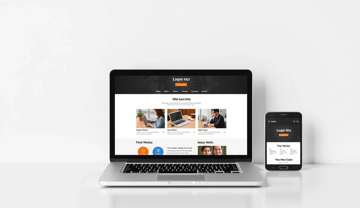
- Fluid Grids and Flexible Images: Our layouts are built on flexible grid systems, allowing elements to rearrange and resize naturally. Images and media are always fluid, scaling proportionally to fit their containers without distortion.
- Breakpoints Tailored to Content: Instead of generic device-based breakpoints, we define breakpoints where the content itself dictates a layout change for optimal readability and usability.
- Performance Optimization: Responsive design isn't just about layout; it's about speed. We optimize images, code, and assets to ensure fast loading times on all devices, especially mobile.
"Responsive design is not just about making your website look good on all devices, but about creating a seamless and intuitive user journey that drives engagement and achieves business goals."
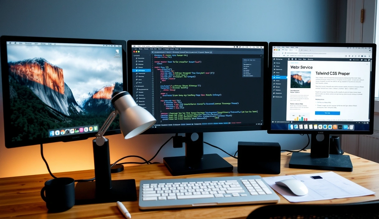
The Technical Toolkit: Tailwind CSS at Our Core
Our mastery of responsive design is significantly empowered by tools like Tailwind CSS. This utility-first framework allows us to rapidly build custom, responsive interfaces directly in our HTML. Its intuitive class-based system means we can create complex layouts and adaptive styles with unparalleled efficiency and precision, leading to lean, maintainable code.
Beyond the Basics: Interactive Adaptability
We go beyond simple layout adjustments. Our responsive designs often include:
- Adaptive Navigation: Hamburger menus, off-canvas navigation, and bottom navigation bars for intuitive mobile browsing.
- Touch-Optimized Interaction: Larger tap targets, swipe gestures, and accessible form elements for touch-screen users.
- Content Prioritization: Smart hiding or reordering of less critical content on smaller screens to maintain focus on key messages.
Ready to ensure your website delivers an exceptional experience on every device? Contact CreativeDock Web Design Studio today for a consultation!